pouet intro icons suggestion
category: general [glöplog]
What Defiance said.

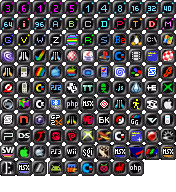
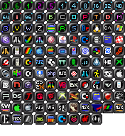
No problems with the actual icons for me, 40, 64, 96 are for "big" intros; 1k and 4k are so frequent nowadays that even newbies will soon get accustomed to it; others are mostly much smaller ones made by rudi (8k, 16k are really unfrequent).
There's only the 128b=160b category which puzzles me! ;p
There's only the 128b=160b category which puzzles me! ;p

I like the icons how they are now, too.

Luis: I really like that color too. more pleasable to the eye.

I´d love to see mog´s suggestion to be implemented.
What Pandur said plus what mog said makes total sense!
mog: that gameboy-icon rulez! MOAR!
What Pandur said plus what mog said makes total sense!
mog: that gameboy-icon rulez! MOAR!

I did some slightly changes. Decided to remove the 1k-, 4k- and 64k icons that i did in my first post. This is just a bunch of ideas. Im not a graphic artist. Poff..

I kinda like raer's idea too. 2^etc..
I kinda like raer's idea too. 2^etc..

mog, i really like your 2.0 icon idea. The additional space is a plus and it looks less chaotic as some of the actual icons do. And i like the idea to consequently use other aspects of the icons, e.g. the color as information too (in a planned and sorted manner). In addition, a renewal holds the change to bring order into the system again.

would be cool to see a complete set of icons that mog suggested and on real page (as an example)

Man, my icons do suck, but mogs... seriously, guys... They look like ass.
Where's all the friggin pixel people 'round here?! Draw a smaller frame, add a number. PROFIT!!!
Where's all the friggin pixel people 'round here?! Draw a smaller frame, add a number. PROFIT!!!

Nothing against mog though, but that's a bit too simple imo.
Y U NO do it yourself? :)

we need a full time 2D artist for pouët
We have one (kenet) but apparently his icons aren't up to everyone's standards ;)

well I think they're pretty cool

What can be "too simple" in 16*16 bytes, yielding 256 pixels?
I am ALL-IN for 16*16 all painted new!
Please some Graphician, make room in yourself!, to make them few new pixels as mog suggested em, show em the glory, WIN!
Fuck kenet, be faster and better, you know you can povide what we all ask for!
(nothing against kenet! pm to kenet: FUCK YOU, you cant win, atleast let someone better try it, like KM! yes, what you thought, just dont take me serious!)
You're drunk. That is good.
It would make much more sense to do a complete pouet redesign

I like Louis' idea. How about a different color for <1k and >1k?

pandur said:
FUCK YEAH
please remove these ugly borders, or reduce them to 1px if you want to keep it, just a bigger icon over a plain black (rounded)square is what we need :3
Quote:
what about removing that ugly border, which takes 50% of the space and btw does not fit to the pouet style anyways.
FUCK YEAH
please remove these ugly borders, or reduce them to 1px if you want to keep it, just a bigger icon over a plain black (rounded)square is what we need :3

raer: I think we've got a winner.
if going pink, do full on hot pink for contrast

Luis: Best one yet. 3, 6, 1 should be another shade still, as they form the micro intro class (<=128 byte) and should be separated from 2 and 5 to avoid some of the confusion when mixing those.

greeeeeen
I'm with mog on this one. More minimalism doesn't only look better, it also makes the icons more readable.