What 300 key fobs looks like and other assorted info
category: offtopic [glöplog]
(and before I get questions of the sort: the orders don't have to be for key fobs or badges. I'm not out to limit the creativity.)

I love the idea of gift certs for demoprizes. I hope this idea catches on, since your work is really nice.

@mudlord, well we'll see. :) I can send down that way, as you know, so maybe first trial will be a demoparty out that way. Who knows?
--------
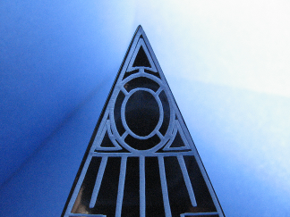
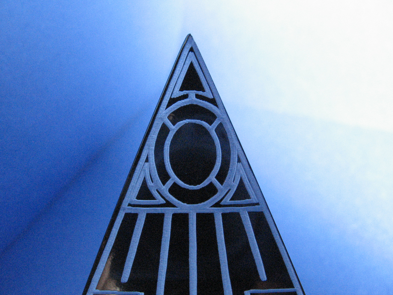
Pictures! I've got more pictures. I apologize for the quality but I didn't take a whole lot this time. I was trying to make sure they got out the door and in the mail so they would arrive with time to spare. As you already know, they made it just fine. :) Leia said I could post this stuff, and the party is over, so ...
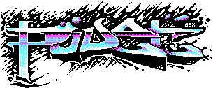
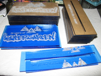
These are the awards I was asked to make for the Kindergarden 2014 demoparty. Click the images to see larger versions.
This is the first iteration with cutouts for the symbols at the top. I also had a version made with the symbols engraved, which was my original suggestion. The reason being that the shapes were too small to do proper cutouts without losing or breaking the itty-bitty pieces. Indeed the line for the flame broke before the plate was even removed from the machine, I was unable to remove the cutout for one of the note "streamers" (accents?), and the eyebrows of the guy broke off when I tried to carefully remove another stuck part. Cutouts like these can work, they just need to be bigger and/or have thicker "bridges". Doing that here though would change the proportions of the top items relative to the text at the bottom.
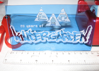
As a backup and to save myself from making an extra trip I made a version while out there to show what I thought would work better for the full run:

(Yes, I do have a red stapler too. No, it's not a Swingline.)
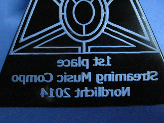
After a small discussion this is what we ended up going with for the full run.
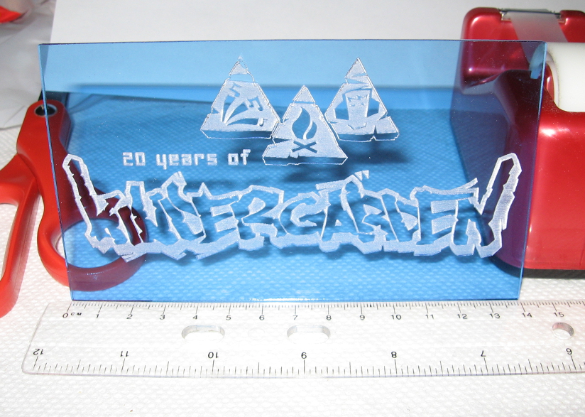
The engraving around the lower text is to replicate the 3D effect from the original logo. I think it works quite well for that. I had originally indicated I can't really do 3D effects other than a single depth engraving. Multiple separate shapes can have different engraving depths, but they may not look much different on acrylic. Also, doing multiple different passes inside of the same engraved area wouldn't really work that well either. However it was still felt the text needed something around it so the above is what was settled upon.
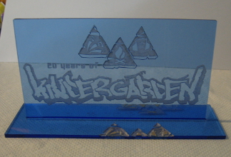
This is showing the plate fitting in to a test base. (The engravings are overlaps from some tests for the top plate.) I had indicated that a slotted base like I had wanted to do for @party's awards would likely crack due to the pressure of a friction/force fit as I had learned that the hard way. In the end @party's slots were made a little larger and I epoxied the two parts together. Not fun. This time I suggested not cutting slots and doing a join to the base with acrylic cement. Leia didn't want the tops fixed to the bases in case plans changed at the party so they had maximum flexibility.
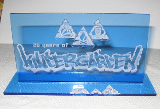
Since @party though, AtomicReindeer on Nectarine clued me in to a blog post about doing interlocking pieces. I found it again, forwarded, and the design was adjusted by Nerdine, Kindergarden's wonderful design wizard. I went out to see about getting the whole run done, and if the bases didn't work at least the tops. Turns out that blog post was on to something! The tops fit in to the bases with only a little force and stayed there without falling out when you picked the award up by either the base or the top plate. I would have only done the tops and sent back more pictures to ask for direction if the base hadn't worked out. I would feel wrong running something I knew wasn't good even though I was trying to make sure I got things done with time to spare.
The bases were engraved with "at least it's not a duck!" (two) and the rest with "least worst [compo name]". As I was unsure, and didn't know a whole lot about Kindergarden, I also sent along an extra set of base plates that said "1st place [compo name]". (The prototype said "1st place" so I actually borrowed that text mashed with the text from the other plates to create the new set.) From listening to the live stream of the closing ceremony, they handed out both plates but most people used "least worst" and one person/group "1st place".
I really didn't do much this time (though I'm sure someone will claim otherwise) other than making sure the designs I got were fitted to the real world size in cm as requested due the exports I got from Nerdine being too large (not anyone's fault!). Thankfully once I figured out the amount to scale the designs by I could reuse it for every iteration and it worked. (I would always check, just to be safe.)
One last photo:
These are all the awards and prototypes. The ones to be handed out haven't been peeled so they still have the paper on. This was to make them more suitable to travel and keep off fingerprints or dings until after they left my hands. Also, in case you didn't know, the white parts are actually caused by acrylic dust left over from the engraving process. It looks rather nice, but after the hackerspace hands me the pieces from the machine I brush a good bit of it off with a large paint brush in to the trash. The first time I engraved on acrylic I washed it off before peeling, but this is more arduous and I think ended up taking off more dust than the brushing. You still want to leave some on to look good. What remains is relatively stuck to the material so it's not going to fall off easily or in a cloud, because you do not want to breath that stuff in. I don't think it would kill or hurt you in the remaining quantity, but I don't recommend licking your awards.
Finally I do have to say everyone I've worked with so far is great, even though I sometimes feel like I'm bumbling through it. (But it's been said people are their own worst critics.)
Just make sure I get enough time to get my stuff done before the event. :) I only barely got the stuff I sent for fun to Nordlicht before the demoparty started. Eek. Kindergarden's came in with a week or two to spare, I forget. Either way, better early than anything else.
--------
Relatedish, if people wouldn't mind, please go back to this post on the previous page and leave your thoughts. Don't forget to read the two short posts after it. (because I didn't think of them when I wrote the original.)
--------
Pictures! I've got more pictures. I apologize for the quality but I didn't take a whole lot this time. I was trying to make sure they got out the door and in the mail so they would arrive with time to spare. As you already know, they made it just fine. :) Leia said I could post this stuff, and the party is over, so ...
These are the awards I was asked to make for the Kindergarden 2014 demoparty. Click the images to see larger versions.

This is the first iteration with cutouts for the symbols at the top. I also had a version made with the symbols engraved, which was my original suggestion. The reason being that the shapes were too small to do proper cutouts without losing or breaking the itty-bitty pieces. Indeed the line for the flame broke before the plate was even removed from the machine, I was unable to remove the cutout for one of the note "streamers" (accents?), and the eyebrows of the guy broke off when I tried to carefully remove another stuck part. Cutouts like these can work, they just need to be bigger and/or have thicker "bridges". Doing that here though would change the proportions of the top items relative to the text at the bottom.
As a backup and to save myself from making an extra trip I made a version while out there to show what I thought would work better for the full run:
(Yes, I do have a red stapler too. No, it's not a Swingline.)
After a small discussion this is what we ended up going with for the full run.
The engraving around the lower text is to replicate the 3D effect from the original logo. I think it works quite well for that. I had originally indicated I can't really do 3D effects other than a single depth engraving. Multiple separate shapes can have different engraving depths, but they may not look much different on acrylic. Also, doing multiple different passes inside of the same engraved area wouldn't really work that well either. However it was still felt the text needed something around it so the above is what was settled upon.
This is showing the plate fitting in to a test base. (The engravings are overlaps from some tests for the top plate.) I had indicated that a slotted base like I had wanted to do for @party's awards would likely crack due to the pressure of a friction/force fit as I had learned that the hard way. In the end @party's slots were made a little larger and I epoxied the two parts together. Not fun. This time I suggested not cutting slots and doing a join to the base with acrylic cement. Leia didn't want the tops fixed to the bases in case plans changed at the party so they had maximum flexibility.
Since @party though, AtomicReindeer on Nectarine clued me in to a blog post about doing interlocking pieces. I found it again, forwarded, and the design was adjusted by Nerdine, Kindergarden's wonderful design wizard. I went out to see about getting the whole run done, and if the bases didn't work at least the tops. Turns out that blog post was on to something! The tops fit in to the bases with only a little force and stayed there without falling out when you picked the award up by either the base or the top plate. I would have only done the tops and sent back more pictures to ask for direction if the base hadn't worked out. I would feel wrong running something I knew wasn't good even though I was trying to make sure I got things done with time to spare.
The bases were engraved with "at least it's not a duck!" (two) and the rest with "least worst [compo name]". As I was unsure, and didn't know a whole lot about Kindergarden, I also sent along an extra set of base plates that said "1st place [compo name]". (The prototype said "1st place" so I actually borrowed that text mashed with the text from the other plates to create the new set.) From listening to the live stream of the closing ceremony, they handed out both plates but most people used "least worst" and one person/group "1st place".
I really didn't do much this time (though I'm sure someone will claim otherwise) other than making sure the designs I got were fitted to the real world size in cm as requested due the exports I got from Nerdine being too large (not anyone's fault!). Thankfully once I figured out the amount to scale the designs by I could reuse it for every iteration and it worked. (I would always check, just to be safe.)
One last photo:
These are all the awards and prototypes. The ones to be handed out haven't been peeled so they still have the paper on. This was to make them more suitable to travel and keep off fingerprints or dings until after they left my hands. Also, in case you didn't know, the white parts are actually caused by acrylic dust left over from the engraving process. It looks rather nice, but after the hackerspace hands me the pieces from the machine I brush a good bit of it off with a large paint brush in to the trash. The first time I engraved on acrylic I washed it off before peeling, but this is more arduous and I think ended up taking off more dust than the brushing. You still want to leave some on to look good. What remains is relatively stuck to the material so it's not going to fall off easily or in a cloud, because you do not want to breath that stuff in. I don't think it would kill or hurt you in the remaining quantity, but I don't recommend licking your awards.
Finally I do have to say everyone I've worked with so far is great, even though I sometimes feel like I'm bumbling through it. (But it's been said people are their own worst critics.)
Just make sure I get enough time to get my stuff done before the event. :) I only barely got the stuff I sent for fun to Nordlicht before the demoparty started. Eek. Kindergarden's came in with a week or two to spare, I forget. Either way, better early than anything else.
--------
Relatedish, if people wouldn't mind, please go back to this post on the previous page and leave your thoughts. Don't forget to read the two short posts after it. (because I didn't think of them when I wrote the original.)
I know some people don't care much for the blatant self-promotion on Pouet, but I've still got some small boxes full of stuff and there's only so many key fobs I can actually use. So just as a reminder http://store.asmcbain.net/ is still out there. If you're worried about security, your final checkout where you provide info other than which products and quantity will be over https. It can also be visited from https://arthur-mcbain.squarespace.com/. I've got around 50 each of both SceneSat designs, and around 140 Nectarine ones. If you don't need one or want one but know someone who does or might, let them know. Lastly because it's the season and I'm not going to miss a chance to be "that guy": there's always Christmas. They are small enough to fit in a stocking! If you wait too long, it might not make it there in time when going international.
(Yeah yeah, I'm done here. Go back to browsing productions, onelinering, or whatever else. Have a good day, if you want one.)
(Yeah yeah, I'm done here. Go back to browsing productions, onelinering, or whatever else. Have a good day, if you want one.)
I'm intrigued by those acryllic flat platforms with the hole... can this be combined with a USB-powered LED to lit the inserted acrylic figure from bellow? I'd be interested in something like that, instant eye catcher in demoparties. :D
...and you know which acrylic figures I'm referring to, I hope :)
...and you know which acrylic figures I'm referring to, I hope :)
The awards IC made in 2010 had said holes with color LEDs inserted from below. The 9V battery was housed inside a luxurious wood carved base. The title of the award was printed on a transparency sheet and sandwiched between two thick slabs of acrylic. I liked the thick cut acrylic slab feature the best.

Quote:
Well you could technically combine such an LED thing with anything. :P However, you could put those things in a slotted base, but the light would only shine up through if the base was translucent or through parts of the slot not occupied. Since the colors for the items aren't translucent like luis's picture above, I'm not sure how nice that would look. They could however be lit by LED from behind and give sort of a silhouette look, though. At least, these are my first thoughts on it.by xTr1m:
I'm intrigued by those acryllic flat platforms with the hole... can this be combined with a USB-powered LED to lit the inserted acrylic figure from bellow? I'd be interested in something like that, instant eye catcher in demoparties. :D
...and you know which acrylic figures I'm referring to, I hope :)
Quote:
The place I go currently can do up to 6mm thick, as far as I know. That's actually fairly decent sized. I think though that those up above look like they were printed on. If you had a large engraved shape, and lit it from behind or behind/below with an LED it would look great. The stuff I make might not look exactly as good as what shows up on Google when you search for: engraved acrylic LED; but it'd be similar. :) It would glow.by █▄ █▄█ █ ▄█▀:
The awards IC made in 2010 had said holes with color LEDs inserted from below. The 9V battery was housed inside a luxurious wood carved base. The title of the award was printed on a transparency sheet and sandwiched between two thick slabs of acrylic. I liked the thick cut acrylic slab feature the best.
LEDs + lasered stuff if great!
But LED + 9V battery - lasts a (short) while.... But:
You can have something lasting a lot longer if a flashing LED with a ~1Hz duty cycle is OK for you (~2 years with a single AA battery ibefore you have to replace it iirc).
http://www.b-kainka.de/bastel59.htm
I recommend the last circuit on the page "Nachtrag: Gegentakt-Treiber, von Michael Ringe" - works pretty well with very bright white LEDs and can be easily build with really small SMD parts.

@las if what you want is a led blinker, you can do that very simply using a 555 timer

Tigrou: The point of that circuit is that it's way more efficient than using a 555 timer (prove me wrong there) and it works with a single 1,5V cell over years.
There's probably some people who've been waiting to see when this would show up. I've had it squirreled away for several months now (on the way toward half a year), for various reasons. One being that I was asked to keep it for a bit longer--but given permission to do what I want with my images--and the other because this didn't pan out but not because it didn't work as an idea. That said, I think this is too good not to share.
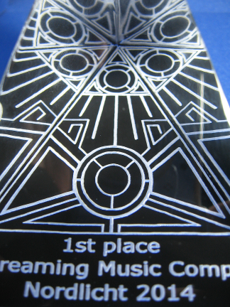
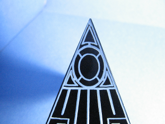
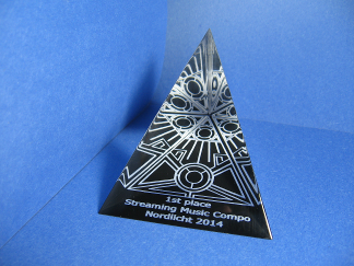
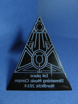
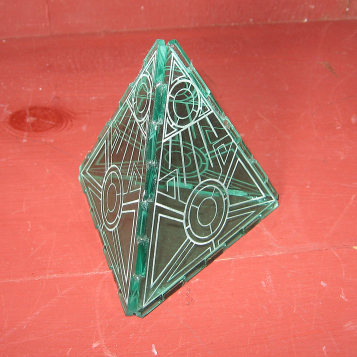
This is the same design as the one used on the tetrahedron, done by dstar and provided by SunSpire. It took a bit of work to fit the design to the acrylic wedges. The design was mirrored before engraving so it appeared the correct direction when looking down from the top. If I recall correctly, they're 3" (7.62 cm) across the front, 4" (10.16 cm) down the long side to the back, and something like 3" tall. The bottom has a black coating applied to it that is engraved into to create the effect seen from the top. Before engraving, the wedges look very dark from the outside. After engraving they become much clearer and the design creates a kaleidoscope effect due to internal reflections. Only two prototypes were made, and both were sent to SunSpire.
The following images are linked to larger versions.
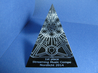
The hackerspace where I had these done has two laser cutters, but only one can lower the bed to accommodate such tall shapes. That cutter has two options for engraving: unidirectional and bidirectional. The former only engraves on one direction of a pass for a line, which is how this one was made. It arguably looks the better of the two as unidirectional engraving is less sloppy. Given the tight tolerances because the design is so close to the edges, the tip was redone a few times on this piece due to stopping progress and readjusting the shape or the jig slightly. Having worked that out here, the second one needed no such adjustments.
This one was made after I learned that bidrectional engraving hadn't been turned on for the first one. Engraving on both directions of a pass for a line means it takes less time to engrave an area, and so reduces my costs. The side-effect is that bidrectional engraving is a tad less precise and thickens shapes horizontally. The difference can be seen in the spacing between the letters, among other places.
Had a complete run gone forward, it was decided they both looked quite good and unless someone had them side-by-side for scrutiny, the difference in neatness imparted by the first one wasn't enough enough to offset the almost doubling of production costs. Even if only produced for first place, having twelve competitions makes that no small chunk of change.
This is the same design as the one used on the tetrahedron, done by dstar and provided by SunSpire. It took a bit of work to fit the design to the acrylic wedges. The design was mirrored before engraving so it appeared the correct direction when looking down from the top. If I recall correctly, they're 3" (7.62 cm) across the front, 4" (10.16 cm) down the long side to the back, and something like 3" tall. The bottom has a black coating applied to it that is engraved into to create the effect seen from the top. Before engraving, the wedges look very dark from the outside. After engraving they become much clearer and the design creates a kaleidoscope effect due to internal reflections. Only two prototypes were made, and both were sent to SunSpire.
The following images are linked to larger versions.


The hackerspace where I had these done has two laser cutters, but only one can lower the bed to accommodate such tall shapes. That cutter has two options for engraving: unidirectional and bidirectional. The former only engraves on one direction of a pass for a line, which is how this one was made. It arguably looks the better of the two as unidirectional engraving is less sloppy. Given the tight tolerances because the design is so close to the edges, the tip was redone a few times on this piece due to stopping progress and readjusting the shape or the jig slightly. Having worked that out here, the second one needed no such adjustments.


This one was made after I learned that bidrectional engraving hadn't been turned on for the first one. Engraving on both directions of a pass for a line means it takes less time to engrave an area, and so reduces my costs. The side-effect is that bidrectional engraving is a tad less precise and thickens shapes horizontally. The difference can be seen in the spacing between the letters, among other places.
Had a complete run gone forward, it was decided they both looked quite good and unless someone had them side-by-side for scrutiny, the difference in neatness imparted by the first one wasn't enough enough to offset the almost doubling of production costs. Even if only produced for first place, having twelve competitions makes that no small chunk of change.
Hi, it's me again. This time I have some tokens I did for the fun of it.
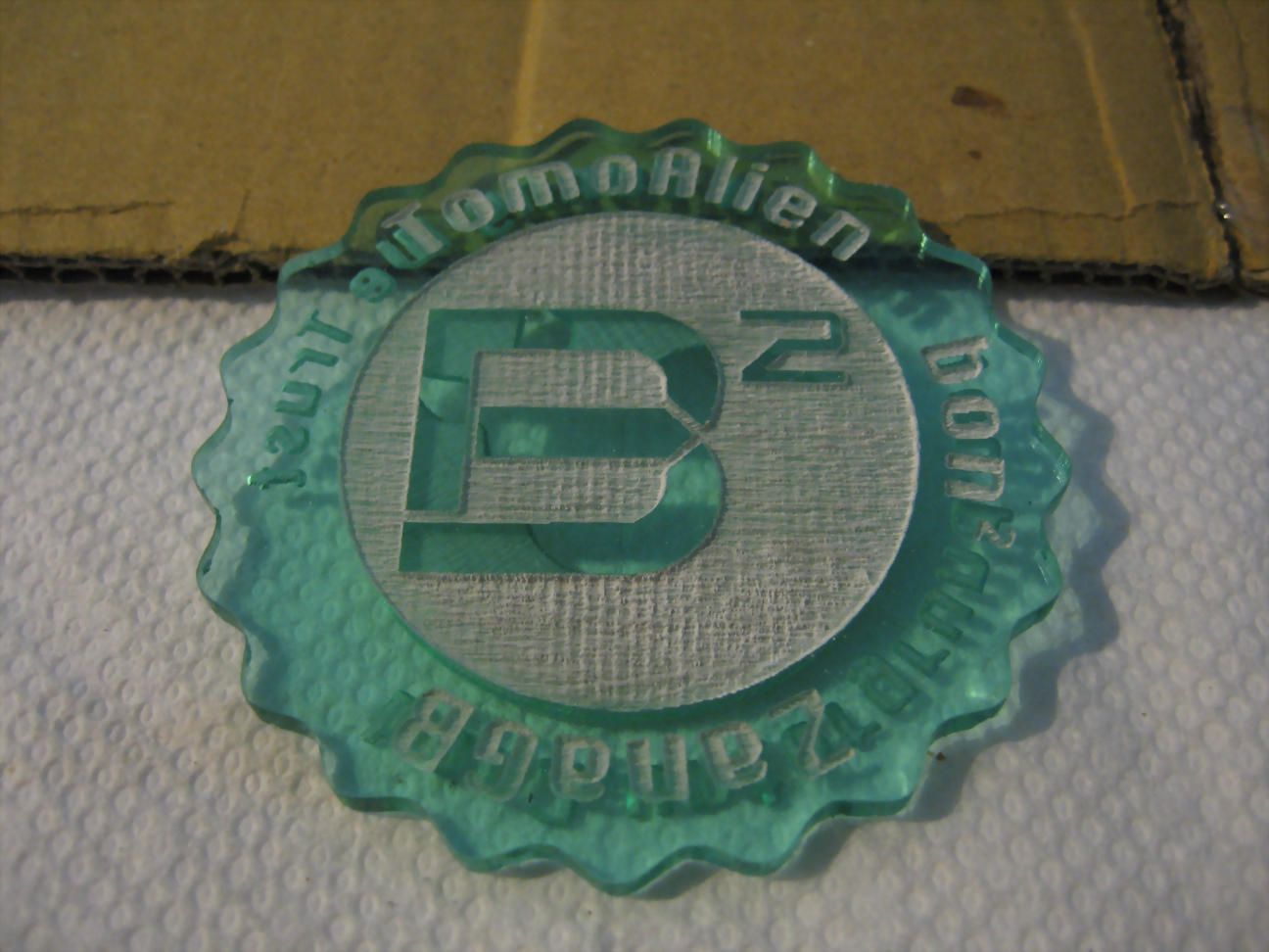
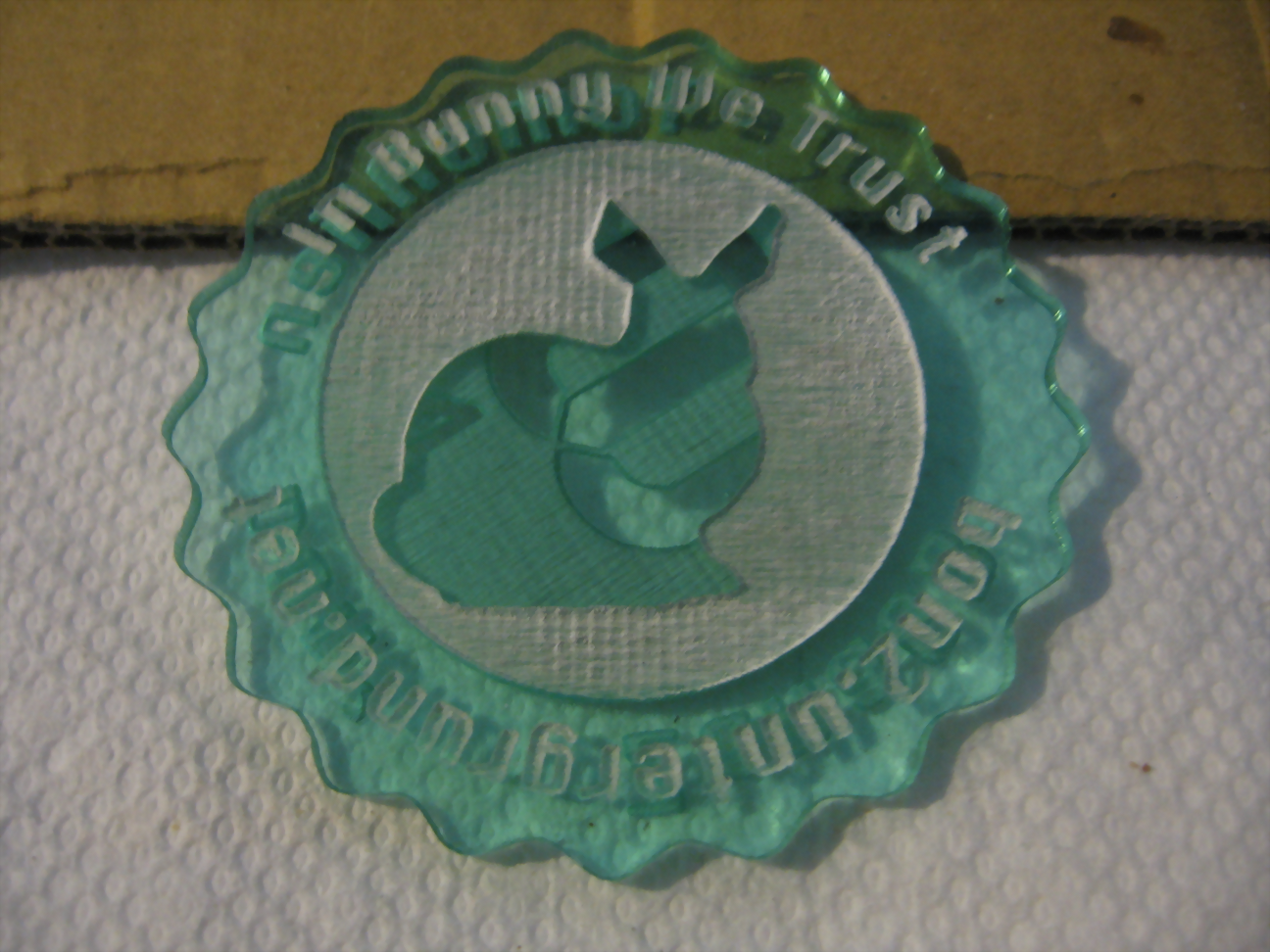
First up is some oversized Bon² tokens. Click to view larger versions.

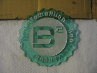

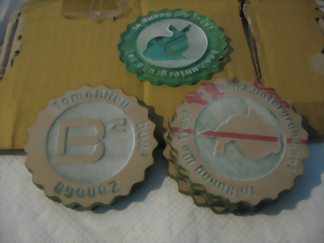
62mm in diameter, 3mm thick.
I started smaller but all the wanted text wouldn't fit. The peeled token in the images above was accidentally rotated when it was flipped. The bunny and B² should be parallel. The others were done correctly. The front reads "TomoAlien bon² ZanaGB" and the back reads "In Bunny We Trust bon2.untergrund.net". TomoAlien and ZanaGB provided design input, the B² logo, and the 2D Stanford Bunny to use.
I got this done with a few other designs I had in mind to test how engraving both sides of acrylic would turn out. They are readable, though darker acrylic seems to work a bit better in that regard. It varies a bit by lighting conditions. I also tested coating a few with white spray paint before peeling off the paper to success. Such a coat should stay on much longer and not rub off. I would show the results of the white spray but it's of a place local to me. If I make one of a more generic token I'll post it here. I also tried a clear matte spray on one of those test tokens to try sealing in the existing color, but instead it wiped it out completely.

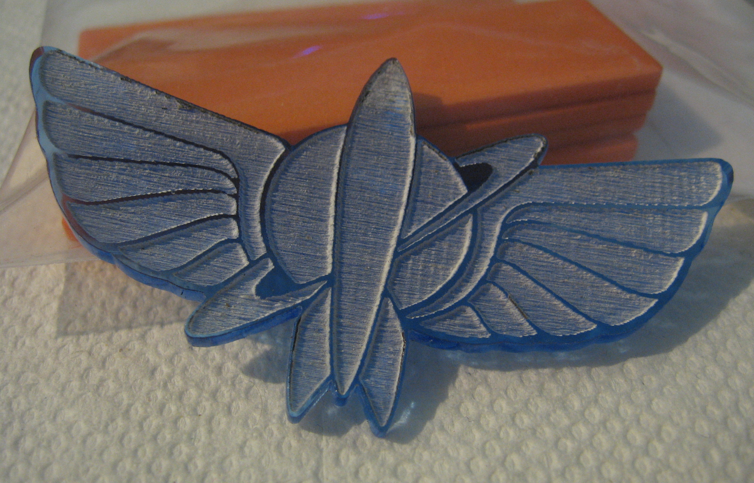
Finally, there was once an animated spin off of Toy Story following Buzz Lightyear as part of Star Command. I didn't see a whole lot of it, but the above is a Star Command logo I made from a vector file I found. It is 75 x 39mm. There's seven of these, including one where not all the sections were properly engraved. Stop by my table at Revision to get one or other little things (that aren't key fobs) I'll have before they disappear.
First up is some oversized Bon² tokens. Click to view larger versions.


62mm in diameter, 3mm thick.
I started smaller but all the wanted text wouldn't fit. The peeled token in the images above was accidentally rotated when it was flipped. The bunny and B² should be parallel. The others were done correctly. The front reads "TomoAlien bon² ZanaGB" and the back reads "In Bunny We Trust bon2.untergrund.net". TomoAlien and ZanaGB provided design input, the B² logo, and the 2D Stanford Bunny to use.
I got this done with a few other designs I had in mind to test how engraving both sides of acrylic would turn out. They are readable, though darker acrylic seems to work a bit better in that regard. It varies a bit by lighting conditions. I also tested coating a few with white spray paint before peeling off the paper to success. Such a coat should stay on much longer and not rub off. I would show the results of the white spray but it's of a place local to me. If I make one of a more generic token I'll post it here. I also tried a clear matte spray on one of those test tokens to try sealing in the existing color, but instead it wiped it out completely.
Finally, there was once an animated spin off of Toy Story following Buzz Lightyear as part of Star Command. I didn't see a whole lot of it, but the above is a Star Command logo I made from a vector file I found. It is 75 x 39mm. There's seven of these, including one where not all the sections were properly engraved. Stop by my table at Revision to get one or other little things (that aren't key fobs) I'll have before they disappear.
Starchaser: Glad you decided to share them! (NL trophy pics) It is really unfortunate we didn't get to make a full production run of these. Remember the high customs fee I had to pay for the single piece you shipped (including your other awesome goodies, of course), imagine what they'd have charged for 36 pieces, plus the production cost just made it very unattractive for us financially.
That one wedge I still have here right now looks absolutely fantastic. The reflection effect inside it is super awesome but you can't really see it in the pictures. Maybe I'll make a video of it before sending it away. (see below)
It was decided long ago that, despite it reading "Streaming Music Compo", we'll donate the sample production wedge to dstar (either at Revision or via airmail), since he created the original design for it.

Nooooooooo mah priiiiize! :D

SunSpire, yeah, I would have liked to see them too. However we also had a tight production schedule if we did as well. The stuff I sent for fun only barely made it in time as it was. At any rate, a video might be nice or at least more pictures. The ones I posted aren't exactly the best. I'm sightly surprised it took people this long to notice them for as nice as they look, since I posted them quite a while ago.
Also, "the sample production wedge"? There were two if you still have both. That or you're keeping one. :) (I think it's obvious why.)
Also, "the sample production wedge"? There were two if you still have both. That or you're keeping one. :) (I think it's obvious why.)
Starchaser: Are you sure? There was only one wedge in the parcel when I received it, plus this acrylic object that you had built (which I still have, too) and the name badges which I handed out to the orgas.
If I had two then one would've been a keeper for sure ..
If I had two then one would've been a keeper for sure ..
I can look and see if I can find it when I get home, but I'd swear I sent you both wedges. I'd look around again. It's possible that somehow back then it slipped my mind to put both in the box. If so, and I find it, I can send it to you if you'd like. It doesn't do me that much good, beyond having an example I can show people of something. (I don't keep much of my work because it ends up getting sent off to other people.)
I know I made two, the pictures above are proof. If wizards were real, I'd blame them ... also, funny thing, so there's an acrylic jig I used to make those prototypes and before I clicked your "this" link, I thought it'd be totally hilarious if it was an image of the jig. That'd mean I did send you two boxes, but they didn't contain what I thought they did. :)
I know I made two, the pictures above are proof. If wizards were real, I'd blame them ... also, funny thing, so there's an acrylic jig I used to make those prototypes and before I clicked your "this" link, I thought it'd be totally hilarious if it was an image of the jig. That'd mean I did send you two boxes, but they didn't contain what I thought they did. :)
I will look*
I'm sorry. I didn't turn my apartment top to bottom, but I did do more than a simple look around. I can't seem to find it. Only the box with the jig in it. The pictures I saved of the customs form parts also show a quantity of two. I'm afraid if you don't have it, it's lost to the ether.
Visited the hackerspace again this past weekend to do some more tokens as I'd peeled some of the ones I had, and couldn't test spray painting them as a result. I also made some cards that I intend to mail off shortly with a box for someone I know.
These are cards in the loosest sense. They're intended to fit in an A6 envelope (4¾" x 6½") with a tad of space left over. I'd used this size before for the previous iteration of the to-be-shown-later birthday card, so I already had a box with 49 remaining suitable envelopes. May as well find uses for them.
Click to see larger versions.
Thank you card #1:
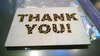
I converted the text to polygons and randomly generated a bunch of circles ensuring at least their center point was within the polygon and that their radius plus a bit of margin didn't overlap any other circles. If a circle didn't fit at that location at the maxium radius, I reduced the radius and checked again. Circles that got too small were discarded. The process then repeated for a fixed number of iterations. I then clipped the circles to fit the bounds of the text paths. I like this one better than the next one and will be sending it.
Thank you card #2:
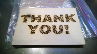
This card was based on the same idea as the last one, but I reduced the maximum circle size and perhaps also the margin. I didn't clip them to the text paths. I don't know what is up with the darker/burned patch, but some of the circles in there didn't go all the way through. I think those things are related.

This is the one of the birthday cards before I started. The original card had text I created myself, and I forgot to leave in lines to keep the insides of letters like "A", "P", "B", "R", and "D" from falling out. It also didn't look very nice. I replaced that with text from a font I liked that I found on my system. The older text wasn't as wide at the same font height, so I recentered the birthday cake and candles under the new text.
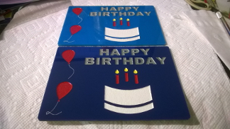
This is the end result. It involved a bunch of painter's tape and spray paint. I masked off each section I didn't want to paint, sprayed two coats about 30 minutes apart, then repeated for the next color. I had to do a lot of overspray to get anything to fall in to the etched lines for the balloon strings. As to the colors, the white is matte, the silver is "metallic" (sparkly), and the rest are glossy. I already had the white and silver, the rest I couldn't find in matte at the local store. It would likely have been easier to do this on white acrylic as a base color, but it still came out nicely. I didn't know which acrylic color would look better so I did both. In the end, I like the top color and will be sending that one. The bottom one won't get discarded though. I'll give it to someone I know to use or save it to send it off to someone for their birthday later.

If you followed the giveaway I did and/or Bittin on Twitter, you'd know these existed already. I had a few made before but they're straight from the machine, only peeled. These I spray painted with white matte then peeled. That means the white color will fade much more slowly (if at all) and will be much more pronounced. Due to accidental overspray some of the paint moved around as I took off the paper mask and little inner letter bits, so I'll unmask the remaining six another day after they're completely dried. As the letters were so close to the edge, I couldn't easily fold over the painters tape for the edges, so I didn't try. This ended up letting a bit of paint bleed down the sides in a few spots where it didn't seal against the edge well.
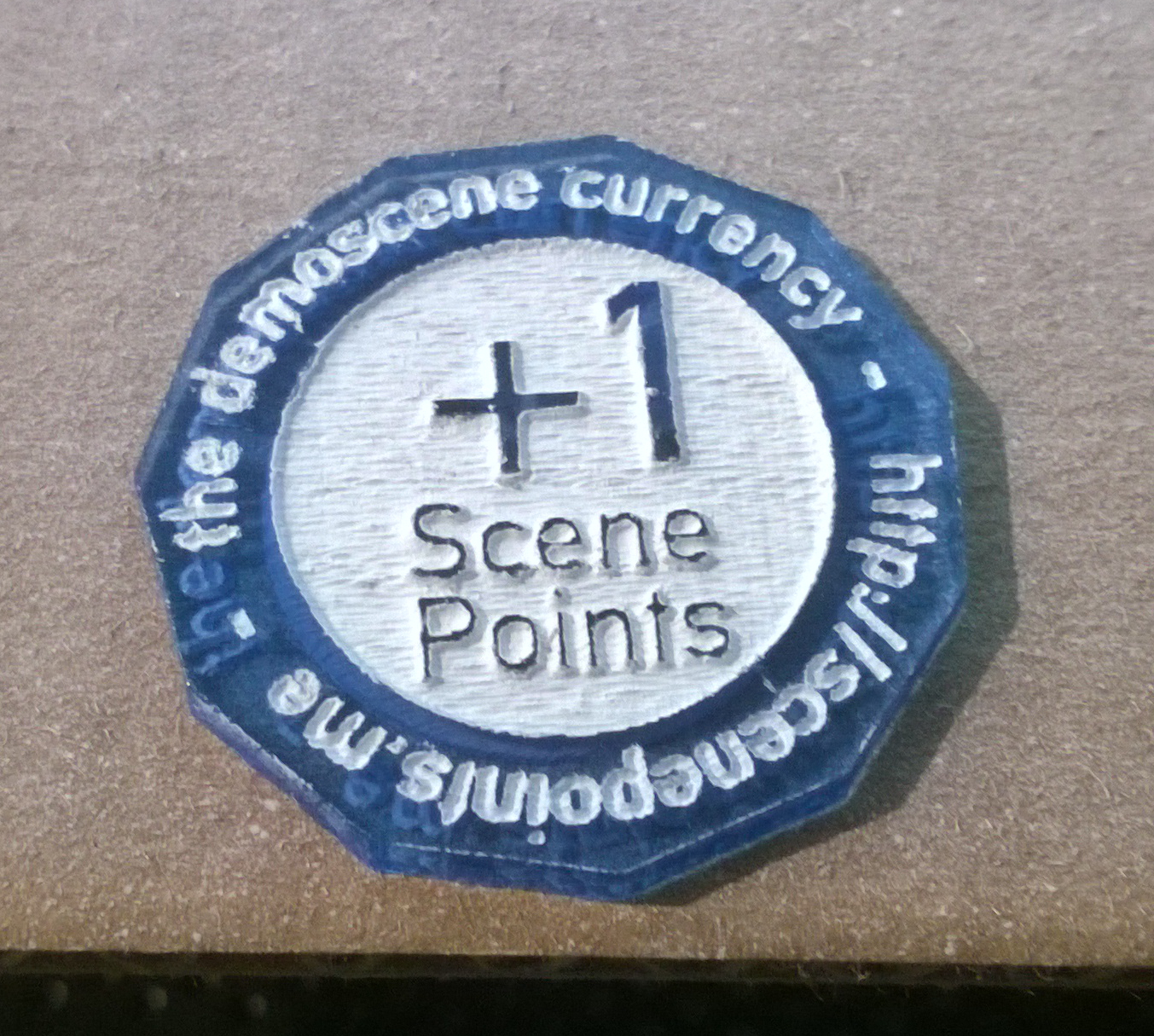
The text is indeed backwards and on purpose. I had originally intended to use these tokesn to experiment with double-sided engraving on acrylic to find out if a) it'd be readable on both sides, b) what variation looked the most readable, and c) if it looked nice. The answer is yes, complicated, and yes, even without spraying to fill. The variations I tried were normal design front and same design back, normal design front and mirrored on back, and normal design on front with a different design on back but with the same text as the front but mirrored. The thought was that if all the parts from the front matched the back (due to the mirroring) it would look the best. Turns out due to a mistake I made, the mirrored designs never lined up with the front rendering the attempts moot. Everything looked fine regardless so I just ran a bunch of the one with the +1 / thumb without further tweaks. So without knowing that, why is the text backwards on the obverse? because it's the backside of the token! That's what I'm sticking with.
These will be coming to Revision, along with the other remaining non-sprayed ones. Come find me to get one.
If you want in-progress shots of the birthday cards or the tokens, see my new Twitter feed.
These are cards in the loosest sense. They're intended to fit in an A6 envelope (4¾" x 6½") with a tad of space left over. I'd used this size before for the previous iteration of the to-be-shown-later birthday card, so I already had a box with 49 remaining suitable envelopes. May as well find uses for them.
Click to see larger versions.
Thank you card #1:

I converted the text to polygons and randomly generated a bunch of circles ensuring at least their center point was within the polygon and that their radius plus a bit of margin didn't overlap any other circles. If a circle didn't fit at that location at the maxium radius, I reduced the radius and checked again. Circles that got too small were discarded. The process then repeated for a fixed number of iterations. I then clipped the circles to fit the bounds of the text paths. I like this one better than the next one and will be sending it.
Thank you card #2:

This card was based on the same idea as the last one, but I reduced the maximum circle size and perhaps also the margin. I didn't clip them to the text paths. I don't know what is up with the darker/burned patch, but some of the circles in there didn't go all the way through. I think those things are related.
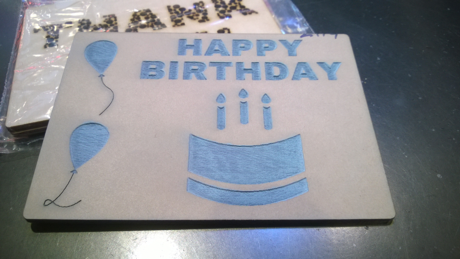
This is the one of the birthday cards before I started. The original card had text I created myself, and I forgot to leave in lines to keep the insides of letters like "A", "P", "B", "R", and "D" from falling out. It also didn't look very nice. I replaced that with text from a font I liked that I found on my system. The older text wasn't as wide at the same font height, so I recentered the birthday cake and candles under the new text.
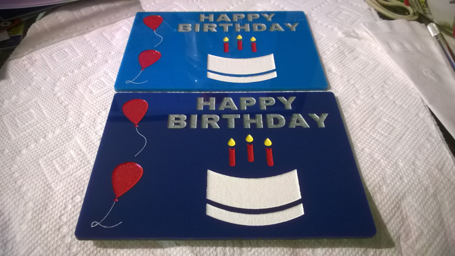
This is the end result. It involved a bunch of painter's tape and spray paint. I masked off each section I didn't want to paint, sprayed two coats about 30 minutes apart, then repeated for the next color. I had to do a lot of overspray to get anything to fall in to the etched lines for the balloon strings. As to the colors, the white is matte, the silver is "metallic" (sparkly), and the rest are glossy. I already had the white and silver, the rest I couldn't find in matte at the local store. It would likely have been easier to do this on white acrylic as a base color, but it still came out nicely. I didn't know which acrylic color would look better so I did both. In the end, I like the top color and will be sending that one. The bottom one won't get discarded though. I'll give it to someone I know to use or save it to send it off to someone for their birthday later.
If you followed the giveaway I did and/or Bittin on Twitter, you'd know these existed already. I had a few made before but they're straight from the machine, only peeled. These I spray painted with white matte then peeled. That means the white color will fade much more slowly (if at all) and will be much more pronounced. Due to accidental overspray some of the paint moved around as I took off the paper mask and little inner letter bits, so I'll unmask the remaining six another day after they're completely dried. As the letters were so close to the edge, I couldn't easily fold over the painters tape for the edges, so I didn't try. This ended up letting a bit of paint bleed down the sides in a few spots where it didn't seal against the edge well.
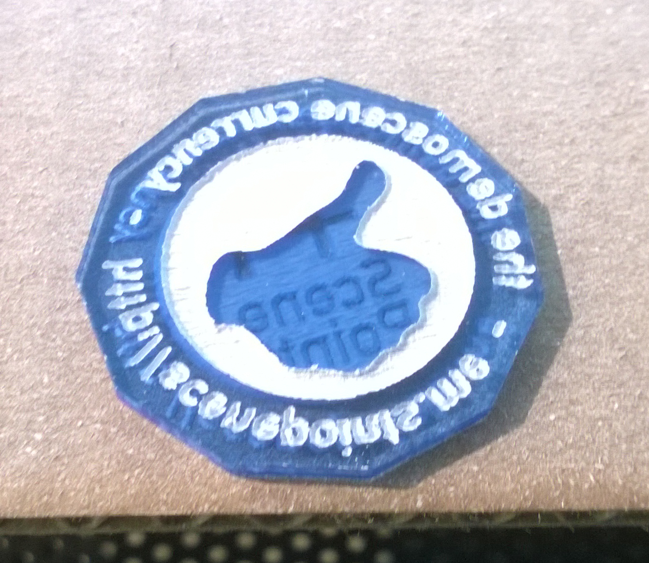
The text is indeed backwards and on purpose. I had originally intended to use these tokesn to experiment with double-sided engraving on acrylic to find out if a) it'd be readable on both sides, b) what variation looked the most readable, and c) if it looked nice. The answer is yes, complicated, and yes, even without spraying to fill. The variations I tried were normal design front and same design back, normal design front and mirrored on back, and normal design on front with a different design on back but with the same text as the front but mirrored. The thought was that if all the parts from the front matched the back (due to the mirroring) it would look the best. Turns out due to a mistake I made, the mirrored designs never lined up with the front rendering the attempts moot. Everything looked fine regardless so I just ran a bunch of the one with the +1 / thumb without further tweaks. So without knowing that, why is the text backwards on the obverse? because it's the backside of the token! That's what I'm sticking with.
These will be coming to Revision, along with the other remaining non-sprayed ones. Come find me to get one.
If you want in-progress shots of the birthday cards or the tokens, see my new Twitter feed.
Correction: A6 envelopes are 6½" x 4¾". I pulled the numbers right off the box without thinking. They put them in the wrong order! width x height, always. :) ~16.5cm x ~12cm for the metric folks.
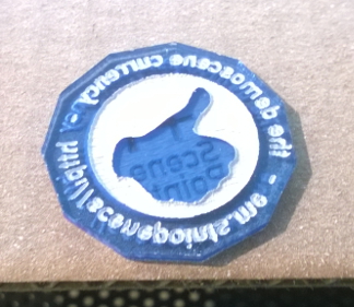
I like the +1 scenepoints :)

same i got some scenepoints a couple of weeks ago also @Starchaser cya at Revision :)

A quick update. These plates had been done last year, but I was asked to not say anything until contact could be made with other TRSI members. This ended up happening at Revision where I also passed off the originals of what is pictured below to the artist, Thexder.
The plates were done at the request of Thexder, who wanted to see if a logo he had created for the group a long time ago could be laser cut. I used the following logo that was given to me in an oldschool format. Thankfully someone had written some Linux libraries which I was able to chain together to output a PNG (or, if it wasn't that, something else I could use). However the logo itself seemed a bit clipped at the time, so I also fixed those in the SVG I created from black and white masks of the original. The only changes were to fix the top left outer border of the 'T', widen the outer right border of the 'I', and ensure the lines for the 'R' that crossed the 'S' were thick enough to survive the engraving process. I tried to follow the existing style so the fixes would look authentic.
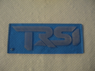
If I recall right, Thexder liked the text alone more than the outline version. He also said I didn't have to carry forward the signature, which I did in a wide/thick font I had on my system rather than trying to replicate the original. As Thexder had thought it might make a nice key fob, I created one that was actually about the right size to use as one given the original size was definitely too big to do so. That is indeed a Kinder egg center in the photo, for unintentional size reference. (As I no longer have the plates, I can't verify their size or retake the photos.)
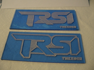
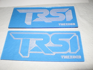
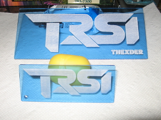
Thexder gave permission to post these photos.

See the Revision thread for details. I also passed out some more ScenePoint tokens as well; see the pictures above in my last update for details.
Just an update, but I finally managed to get rid of the remaining key fobs at Revision this year. It's good to be done with them, at least that batch, because they'd been at my apartment for a year and a half, excluding the time they spent at Revision in 2014.
However this means I don't currently have anything in the pipeline and nobody has approached me with any ideas. If there's something you'd like me to see do, contact me. Custom group key fobs, tokens, badges, some other idea ... what have you. (I think the staff key fobs I did for Revision last year and those for two parties were rather well liked.)
Now is a pretty good time to talk to me about something for Revision next year, that way I can ensure it gets done with no panicking involved. I don't need a year's lead time, but having a few months + shipping time is always nice.
The plates were done at the request of Thexder, who wanted to see if a logo he had created for the group a long time ago could be laser cut. I used the following logo that was given to me in an oldschool format. Thankfully someone had written some Linux libraries which I was able to chain together to output a PNG (or, if it wasn't that, something else I could use). However the logo itself seemed a bit clipped at the time, so I also fixed those in the SVG I created from black and white masks of the original. The only changes were to fix the top left outer border of the 'T', widen the outer right border of the 'I', and ensure the lines for the 'R' that crossed the 'S' were thick enough to survive the engraving process. I tried to follow the existing style so the fixes would look authentic.
If I recall right, Thexder liked the text alone more than the outline version. He also said I didn't have to carry forward the signature, which I did in a wide/thick font I had on my system rather than trying to replicate the original. As Thexder had thought it might make a nice key fob, I created one that was actually about the right size to use as one given the original size was definitely too big to do so. That is indeed a Kinder egg center in the photo, for unintentional size reference. (As I no longer have the plates, I can't verify their size or retake the photos.)
Thexder gave permission to post these photos.

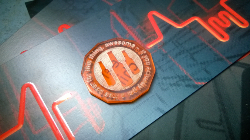
See the Revision thread for details. I also passed out some more ScenePoint tokens as well; see the pictures above in my last update for details.
Just an update, but I finally managed to get rid of the remaining key fobs at Revision this year. It's good to be done with them, at least that batch, because they'd been at my apartment for a year and a half, excluding the time they spent at Revision in 2014.
However this means I don't currently have anything in the pipeline and nobody has approached me with any ideas. If there's something you'd like me to see do, contact me. Custom group key fobs, tokens, badges, some other idea ... what have you. (I think the staff key fobs I did for Revision last year and those for two parties were rather well liked.)
Now is a pretty good time to talk to me about something for Revision next year, that way I can ensure it gets done with no panicking involved. I don't need a year's lead time, but having a few months + shipping time is always nice.
Ok, small correction. For the astute, I also removed the gap in the outline between the 'S' and 'I' on the outline version, as it would appear the same height as the letters and, I think, look odd or accidental.