
horrid platform icons
category: general [glöplog]
keops: nice idea, but we should increase the size of the black rounded box a little to fit the 16x16 icons in them.
Btw, there's no need to include the rounded box in the icons. It can be done with CSS via a class attribute or with a pattern identifier matching the path of the images.
Btw, there's no need to include the rounded box in the icons. It can be done with CSS via a class attribute or with a pattern identifier matching the path of the images.
keops's screenshot does look nice indeed :)

YAY!

a few more icons and some layout suggestion: 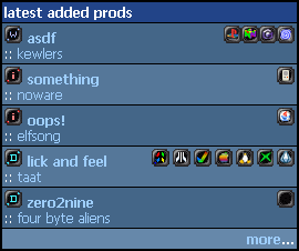

no, the 16x16 icons are ok, bigger ones would destroy the layout again. Keop's suggestion is almost perfect I'd say - and most of the icons are recognizable.

now that i done the column separator its time for ppl to tell me it looks better without one :)
waiting for those icons from keops!
waiting for those icons from keops!

get these ones already: http://equinox.planet-d.net/poueticons/
Mac icon sucks but I'm too lazy to make another one right now ;)
By the way, you should align the icons on top instead of middle, it would look nicer (aligned with the type icon on the left)
Mac icon sucks but I'm too lazy to make another one right now ;)
By the way, you should align the icons on top instead of middle, it would look nicer (aligned with the type icon on the left)
ps: you could use [img]http://poi.ribbon.free.fr/tmp/platform_bg.gif[/gif], with the following CSS rule
.platform_icon
{
width:16px;
height:16px;
padding:4px;
background:url('platform_bg.gif');
}
.platform_icon
{
width:16px;
height:16px;
padding:4px;
background:url('platform_bg.gif');
}
mime!!
demo/mach-o
demo/mach-o

keops icons looks the best no doubt. why arent they being used?

and keops' layout is the best too
ps: how about <table><tr><td>[categoryicons]name</td><td align="right">[platformicons]</td></tr></table> instead the layout you've done?
ps: how about <table><tr><td>[categoryicons]name</td><td align="right">[platformicons]</td></tr></table> instead the layout you've done?
double post! yaaay! ;)
kb: http://test.pouet.net im working on it ;)
keops: great icons dude.. the layout was just what i had in mind myself :) (see ps, i told you :)

i fully prefer keops' icons \o/

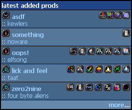
there... index.php updated! now just shitload of icons missing using keops technique and everything will look nice and clean again...
ok, last missing icons, I'll do the rest tomorrow:
By the way, the "who posted/commented" icons really overloads the layout on the main page imo, I guess it's the kind of information most people don't seek on the main page at all ;)
By the way, the "who posted/commented" icons really overloads the layout on the main page imo, I guess it's the kind of information most people don't seek on the main page at all ;)
True. the last poster looks lame. Good job keops, those are really fine icons. Pouet looks like a whole new page nearly :)
keops: well i find myself often clicking the prods to see that info, so fuck the ppl who dont want to see it ;) let them use adblock or the rss feeds if they dont like overinformative index.php's ;)
but yeh a light version of index.php and prod.php would be nice. its on todo for a long while now.
Ofcourse that was supposed to be. the last poster ICONS , look lame. It really spoils the layout.
the "last poster" info shoud be disabled by default imo, and user should be able to enable it through his custom settings as the newbie/non logged user usually doesn't care about the laste posters but rather cares about the newly released/added prods.
Too much info ruins it ;)
Too much info ruins it ;)
ATM the icon of VIC20 is also assigned to the PS2 and mobile phone.
p01: well, if you are patient enough we're working on it, I submitted them a few minutes ago...