Loader - an almost useless piece of software
category: general [glöplog]

The GUI looks not professional. In my opinion, it can't be done any wronger... completely different distance proportions between GUI elements, and non-standard background colors. Too much free space on the top. Think about any (no, I mean all) serious loaders you have seen in your entire life. Which loader has a pink / green / orange background?
The progress bar and the percentage label both overflow to the right, i have to manually resize the window so that I can read the percentage...
And there's no Cancel button.
There's a lot of GUI design esthetics that can be learned. You might want to take a look at Microsoft's Official Guidelines for User Interface Developers and Designer, for example. There are also some for linux, and surely some from IBM. My point is, that there are standards for GUI design.
Well, that post was not for "Loader" precisely, but for all borland coders out there that tend to change colors everywhere just because they can...
xTr1m: I am not sure this is so important. I mean, seriously, I know what standard design is. In this case it was not the goal. Loader is not a utility that had any useful application in mind. Once it is done you can see if you can do something with it.
It is actually the way we look at the world around us - we see what we have and then think how to use it. the same concept is behind my almost useless apps.
Also, the colors are standard for applications like IBM WebSphere - the installators there have lots of weird colors. But again - I doubt that someone will seriously start looking into what the Loader is and why is it unprofessional and whatnot. If they will, than this joke will not work on them anyway, if they are that thorough. For most people the illusion will be 100% good.

Besides, you can start up several Loaders and then choose only the realisticly looking ones and close the rest. the colors and heights are randomized a bit so that you get some variety. just choose what you like )
Quote:
The progress bar and the percentage label both overflow to the right, i have to manually resize the window so that I can read the percentage...
I have no such thing on my two computers, to be honest
Ever tried scaling up your fonts to 120% through windows? There are users like me with HUGE resolutions, who adore the way Vista scales up fonts. That means, that your GUI elements have to orient themselves not only relative to the top-left coordinate, but also to the bottom-right coordinate. In Borland it's the Anchor property.
Quote:
Ever tried scaling up your fonts to 120% through windows?
Not really, but I see your point. To write the next version of Loader I'll hire real programmers.
Quote:
Well, you can start up a couple and people will see your computer is busy - sometimes this is handy and may explain why you cannot do your work and instead loiter around with a beer
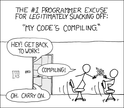
What the hell? Two pages in and nobody's posted the obligatory XKCD reference?