|
bcnparty'01 invtro by Fuzzion [web]
[nfo]
|
||||||||||
|---|---|---|---|---|---|---|---|---|---|---|

|
|
|||||||||
|
popularity : 63% |
|||||||||
alltime top: #8564 |
|
|||||||||
|
||||||||||
added on the 2001-09-12 18:57:01 by bp  |
||||||||||
popularity helper
comments
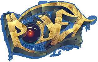
okay, the 3D lines becoming underlines effect, that's very very very cool.
added on the 2001-09-13 22:41:04 by golrien 
Damn, I'm getting sick and tired of this style (white background, flatshaded boxes and stuff), and this wasn't even a good implementation of the style. The chiptune was far from good too...
is it just me or is the font REALLY ugly?? (truetype??)

I found this production ugly. And I'm really impressed to see this coming from Dr Pain as he has always had another style. Not a good job this time. Come on Fuzzion, you can do it better, and we all already know it :)
i have to agree with the others here. bad font/text effects, boring "effects", no design and the music sucks.
blah, fucking blah. looks like shit. sounds like shit. this makes me depressed.

I think you are pityful.. for once this style had a meaning.. not to be a "cool" smashing intro... but to be an invite for aswell oldschool as newschool.. and it served its right for that and was imho pretty nice done..
"no dezin".. ehh wtf? it is only olschool dezin as i see with touch of newschool (makit in newschool (3d))
"no dezin".. ehh wtf? it is only olschool dezin as i see with touch of newschool (makit in newschool (3d))

Hey suckers, the intro design matches the party's logos and design. That's why it's flat colored. Pain rlz

i think it was ok, not brilliant - but it served it's purpose.

The concept design it was really really good: that cilinder with flat color lines provides a wide range of BCN Party's logo alike combinations. But the intro itself it's boring, repetitive. The font it's far from fitting with the style. May be needs another 48 hours of work and/or another angry coder more.

I liked it.

Hey! The music sucks, yeah. But I made it when I was 16. Check http://wonder.planet-d.net for better stuff. :PPP

JESUS YOU BUNCH OF FREAKS =)
Just because VIP2 was such an outstanding invitro doesn't mean invitros are meant to baffle, they're to inform you of stuff. Take a gander at other invitros over the last decade and see.
sheesh.
Even so, the downtrodden style of retangles and flatshading is being used well. I've seen a lot of competing demos/intros in this style with worse design and effects. The overall red and blue should be recognizable for anyone with an inklink of Commodore history. There's actually some good timing in it too.
The font *is* horrible though =)

this intro is one of teh best ive seen . It has style which is noty so common i think ( do i need to mention dxm ?..... yes i think so )
congrats anyway
congrats anyway
Good style, good design, good and direct invtro. A like a lot.

I don't usually fancy that kind of a style, but this intro is beautiful in a very simple way. Fuzzion, you rox0r.

Bcn Party Design Rules. Bcn Party Invitation Rulez too. Nothing more to say.
WOOOPA!

Designers Republic style.

Hey, it feels strange when (while being boozed) you select a random prod in pouet and it happens to be one yours.
Funny :P.
After reviewing the comments, I need to add some things.
First, the design was premade, in the sense the intro design was supposed to fit the "global" design for the bcnparty. The specific scenes in the intro where product of a raging coder, but the colors, font, logo and general feeling were the work of many other people (for good and bad). I had some problems to get the "official" font used in the bcnparty design at first time, so I used some "test" font I was playing at that time. Maybe it's strange but even now I like more the font I used at first than the official one (planified obsolescence???)
Second, the music was gentle given by Wonder, but it was a REALLY old song that was strangely surviving in his hard drive, without being used in any prod. Wonder is really a great musician and you should check his other songs.
Finally, thanks for the comments, both positive and negative. It's always nice to see what people thinks of your work
Oh, the thumbs up was not for the prod but for the comments posted to it. Thanx
tunnel idea and logo effect was great!

Pretty good design. The beginning atmosphere is really kick-ass.

nice idea.
visual was unique.
music was oldskool.
anyway good.
visual was unique.
music was oldskool.
anyway good.

What shash said.
Pretty simple but not bad. The music is horrible though.


slightly annoying but also catchy at the same time

does the job

submit changes
if this prod is a fake, some info is false or the download link is broken,
do not post about it in the comments, it will get lost.
instead, click here !