
Ribbon UI vs. 3dsmax
category: general [glöplog]
Hm, am I the only one that thinks the ribbon UI concept is bad in an age of widescreen monitors?
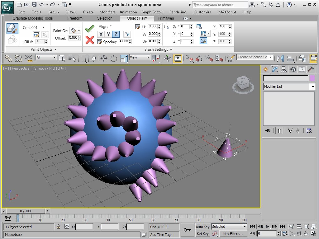
Especially in 3dsmax it seems the main viewport real estate is really small:
http://images.gamedev.net/features/reviews/3dsmax2011/fig4.jpg
They should have invested their time & money in some other issues imho, but well..
Especially in 3dsmax it seems the main viewport real estate is really small:
http://images.gamedev.net/features/reviews/3dsmax2011/fig4.jpg
They should have invested their time & money in some other issues imho, but well..
Ouch! Nielsen disapproves :D
I tend to use my bars on the sides whenever it's possible.
I tend to use my bars on the sides whenever it's possible.

I find ribbon UIs the worst piece of crap since dogshit was invented.

it's not the ribbon UI that's broken, it's the above implementation of it :/

Maybe all UIs should have all the tools + buttons on the sides instead of the top/bottom now. Widescreen + lots of buttons gives you lots of dead space and a stupid thin content area, that 3ds screenshot is just one more example. One of the first things I do on a mac is move the dock to the side so it's wasting less space.

3dsmax' interface is getting worse with every new release since v2009, when the new maya is getting better and better.
really hope autodesk guys will bring that xcr thing to the next year.
overwize, me seriously thinks of switching the tool.
max 2011 is such a pure disaster.
the ribbon tool is a little and not at all the worst thing those corporate casual-wanking suckers delivered.
and that's not the ribbon tool on the screenshot, that's the graphite toolset which btw can be docked to the left side of the window too.

Ribbons suck. Word 2007 is another obvious example. You mostly work with A4 pages in portrait mode, so a 16:9 document area sucks even before they squash it some more with the task bar, status bar, window title and now the fucking ribbon, too.
I mostly blame widescreen monitors, though, and egomaniacal UI designers who insist that their apps must dominate the screen, completely forgetting what windowed user interfaces were supposed to be about. Of course that traces back to Microsoft and Apple getting a few key things wrong from the beginning (like all windows popping to the front when they receive focus, completely out of touch with the "desktop" or "workbench" principle).
I mostly blame widescreen monitors, though, and egomaniacal UI designers who insist that their apps must dominate the screen, completely forgetting what windowed user interfaces were supposed to be about. Of course that traces back to Microsoft and Apple getting a few key things wrong from the beginning (like all windows popping to the front when they receive focus, completely out of touch with the "desktop" or "workbench" principle).

Yeah, HUGE fuckings to windows that steal focus.
"The quick brown fox jumped over the laz[at this point a popup appears with a large red warning sign and a message you don't get chance to read]y[box disappears, you don't know what you agreed to but the hdd is now very busy]" FUUUUUUUUCK!
"The quick brown fox jumped over the laz[at this point a popup appears with a large red warning sign and a message you don't get chance to read]y[box disappears, you don't know what you agreed to but the hdd is now very busy]" FUUUUUUUUCK!
doom has leading, 1oo% ack (word & focus-style).
being on the windows UI stuff: How long it took them to finally realize, that it would be a good idea to remember the last path the user browsed to when popping up a file open/save dialog and make the freakin filelist window resizable.. Now if they "only" would also remember the last scrollbar position and hilight the last selected file.. (or is that available in Vista/7?)
being on the windows UI stuff: How long it took them to finally realize, that it would be a good idea to remember the last path the user browsed to when popping up a file open/save dialog and make the freakin filelist window resizable.. Now if they "only" would also remember the last scrollbar position and hilight the last selected file.. (or is that available in Vista/7?)
we're sceners, aren't we supposed to love ribbons?

isn't ribbons just some weird incarnation of a tabview?

The solution is simple: ban 768px tall displays, especially 1366x768.

yum!


psonice: I don't mean windows that steal focus, although those also suck. The problem is that when you click on any window, it immediately jumps to the front. That makes it impossible to work with multiple windows, unless you have enough screen space to avoid overlapping them.
E.g. you can't run a word processor on most of the screen and have a little calculator app sitting on top of it, without constantly losing the calculator underneath the word processor. You always end up switching back and forth between windows with alt-tab or with the task bar. This stupid auto-pop-to-front behaviour, incidentally, is why the task bar was such a welcome addition to Windows, because with it you can actually find your windows in the resulting mess.
AmigaOS has a much more elegant solution; it simply leaves your windows where you put them, and provides a button on the window border for rearranging them depth-wise if and when you want to do so. It sounds like a tiny little detail but it makes a huge difference to how you work with multiple windows and what use you can make of the number of pixels on your screen. It also reflects in how apps are designed; they become much less dominating and much more "cooperative" in their designs, if that makes sense.
neoneye: Yes, a ribbon is like a tabbed toolbar.