
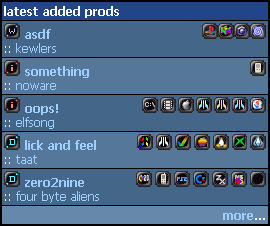
horrid platform icons
category: general [glöplog]
well, well, I'll wait, but just because it's you. :p
Quote:
so fuck the ppl who dont want to see it
Hooray for the icon fest, and screw you too!
At least give those cells a proper class so we can set it's display property to none. This is an angry fruit salad in the making.

Quote:
so that you can get rid of the useless width, height and border attributes, and that you can also add a margin-right of 1pixel to the img tag.give those cells a proper class
and how about an 1x1 transparent GIF for the WiLD platform ;)

keops is doing a film strip kinda thing for the wild.. lets see how it turns out..

kb: was sagst du? :)
flash : 
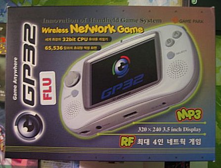
gamepark32 :
intellivision :
gamepark32 :
intellivision :
hux+p01: do you still need the class for the whoaddedprods and whocommentedprods now that they are selectably show/hideable?
p01: updated! thx! \o/
p01: updated! thx! \o/
acorn:  ( better AA than the current one )
thomson:
ps2:
msx:
macOs:
macOsX:
( better AA than the current one )thomson:
ps2:
msx:
macOs:
macOsX:
yippie! Pouet Reloaded in progress! :D

ms dos/gus : 
sega master system :
sega genesis/megadrive :
BeOS :
Gameboy Advance :
sega master system :
sega genesis/megadrive :
BeOS :
Gameboy Advance :
p01: It would be better if the GamePark GP32 icon would be orange or red. Currently the lines are... blue or something.

gameboy advance should feature the REAL gameboy, not that faggy SP.

p01: they are nice but some of your icons don't respect the 3 pixels margin on each side I set for the previous ones and the logos are somewhat out of the frame (PS2, MSX etc...).
Maybe you should try to darken the corned and the edges of the logos.
(The PS2 logo does not respect the original ps2 logo colors by the way)
I might look nit-picking but that's what design is all about ;)
Maybe you should try to darken the corned and the edges of the logos.
(The PS2 logo does not respect the original ps2 logo colors by the way)
I might look nit-picking but that's what design is all about ;)
keops: i took his ps2 couz it was more readble then yours.. :D
Errr... I forgot... the system itself is called "GP32" and the company's name is GamePark. Can someone please change the name of the system to "GamePark GP32"?
And I did an icon for the Virtual Boy system.

And I did an icon for the Virtual Boy system.
TI-8x : 
SNES :
keops: ok, ok I'll try to chop some icons.
Okkie: it's easier to fit a GBAsp in 10x10 pixels :p
freeze: I've also seen a GP32 logo looking a bit like the GC logo. cf here
SNES :
keops: ok, ok I'll try to chop some icons.
Okkie: it's easier to fit a GBAsp in 10x10 pixels :p
freeze: I've also seen a GP32 logo looking a bit like the GC logo. cf here
ps: try this one, it respects more the original ps2 logo and the general layout for the icons imo

I editied the GP32 logo by myself a bit. ;)

p01: Oh hmmm... even as a GP32 owner I'm a bit confused now. Actually the GP32 (product) logo itself is this one:
http://images.google.com/imgres?imgurl=http://www.pcgamesportal.de/img/specials/gp32/gp32_logo.jpg&imgrefurl=http://www.pcgamesportal.de/index.php%3Fsite%3Dgp32&h=112&w=150&sz=26&tbnid=DOJFhfsFnOYJ:&tbnh=67&tbnw=89&start=8&prev=/images%3Fq%3Dgp32%2Blogo%26hl%3Dde%26lr%3D%26client%3Dfirefox-a%26sa%3DG
...but the GamePark (company) logo is this one:
http://images.google.com/imgres?imgurl=http://www.skjoldhammer.dk/gp32/gp32_gamepark_logo.gif&imgrefurl=http://www.skjoldhammer.dk/gp32.html&h=36&w=169&sz=3&tbnid=-1RvRejDY00J:&tbnh=20&tbnw=93&start=18&prev=/images%3Fq%3Dgp32%2Blogo%26hl%3Dde%26lr%3D%26client%3Dfirefox-a%26sa%3DG
p01: touche, i'm hurting my breain to find a way now :)
p01: besides that, nice ones ;)