
ZX Spectrum Pallete vs. Commodore 64 pallete
category: gfx [glöplog]
Quote:
So the C64 colour palette is based on HUMAN ARTISTIC PREFERENCE? That sucks. I obviously don't agree with their colour choices, and no doubt do nor many others.
Hey, surprise. We are humans. If you don't like it, that's fine, but why do you need to justify it by assuming "many others" agree with you?
Quote:
You can still achieve somewhat decent hues by dithering RGB colors.
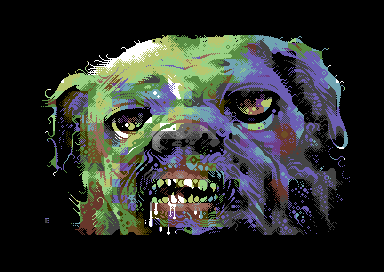
While theoretically true, there aren't a lot of ZX images with convincing skin tones around.
Quote:
But you cannot get bright ones by undithering a palette which does not cover the full color range somewhere.
You can't get the bright ones outside the max values of your monitor's RGB colour space either. Limitations are generally fine as long as the most useful cases are covered.

Quote:
Yes but Commodore were still trying to sell it as a buisness machine in the '80s, whereas it was being bought primarily for games.
WTF? Didn't Commodore realise that there was a far greater market for games than business back then? Why were these companies so OBSESSED with BUSINESS? I'm baffled that they did the same thing with the Amiga, even if it was technically an equal or superior contender against the likes of IBM and Apple. But games are where it's AT, baby!

If I recall, this is from the MONTEST program as a diagnostic for monitors for the C64:

Did the designers of the VIC-II choose the colours then name them? Because technically there's nothing wrong with this choice, but they are definitely subjective according to what people think pink or brown or orange is. Is it any wonder that VICE comes with many palette files for the C64, based on people's different preferences? And the very nature of the hardware design, which means that different TVs and monitors show different colours, especially with the colour controls on each?
I've also heard that people want to stick with what they remember of the C64 palette from their own use of the machine, even if the colours were different from what the designers intended, and they were different when going from NTSC to PAL, as shown here:
http://hitmen.c02.at/temp/palstuff/
The first screenshots of the startup screen in NTSC and PAL are totally different, and PAL looks worse with the purple tinge, even if the PAL signal is more stable across monitors and TVs. I prefer the NTSC look, frankly.
I suppose, in the end, it doesn't really matter, as in you can use your own preference for the colours, as long as they match the general descriptions, but the default PAL palette could be a bit brighter and retain the intentions of the designers for more subtle colours.
Quote:
If I recall, this is from the MONTEST program as a diagnostic for monitors for the C64:
Isn't that a PAL palette? If the machine was designed for NTSC, perhaps the colour names are more accurate with an NTSC palette?
Quote:
Quote:If I recall, this is from the MONTEST program as a diagnostic for monitors for the C64:
Isn't that a PAL palette? If the machine was designed for NTSC, perhaps the colour names are more accurate with an NTSC palette?
That's exactly my point, Absence. Since the C64 is NTSC in origin, that should've carried over to PAL as well. It didn't quite do so.
I thought that was common knowledge in C64 circles by now. What are you getting at?
Quote:
I thought that was common knowledge in C64 circles by now. What are you getting at?
It bugs me that so many people are willing to accept the dull and wrong PAL colours when that's not what the designers intended. I know that users of the C64 didn't have much choice when it comes to real hardware, but they could at least put the NTSC palette on the emulators they use to take the screenshots for the web, as intended. Oh, and CSDb.
Basically (and this is IMHO) C64 PAL palette SUCKS, C64 NTSC palette ROCKS. Flame away!
Most c=64s got sold in PAL-regions iirc.
So most people had what is described in your hitmen-link under PAL DECODING...and got used to it as they never saw any NTSC-colors with their PAL-TVs.
So the consequence is that we like what we are used to. Same as with everything else.
So most people had what is described in your hitmen-link under PAL DECODING...and got used to it as they never saw any NTSC-colors with their PAL-TVs.
So the consequence is that we like what we are used to. Same as with everything else.

Flame away? Sounds like you're trying to start a quarrel where there isn't one. :) European C64s had the PAL colours, American C64s had the NTSC ones. When emulating a European C64, a PAL palette is correct. Doesn't matter if it's uglier than what the original designers intended, because it's what the actual physical machine had, and it's the only thing Europeans ever saw on their screens. Why don't you just accept that the world isn't perfect and get on with it? Or better yet, make an NTSC C64 demo about it. :P
Quote:
Quote:Yes but Commodore were still trying to sell it as a buisness machine in the '80s, whereas it was being bought primarily for games.
WTF? Didn't Commodore realise that there was a far greater market for games than business back then? Why were these companies so OBSESSED with BUSINESS?
What a surprise: A company (originally) called Commodore Business Machines is selling to... businesses. :D
And the obvious point: Games were pirated by kids with no money. Properly licensed and supported software for businesses actually made money on a predictable basis. Spreadsheet and accounting software titles were the early killer applications. There's a reason the Plus4 had a spreadsheet software build-in. Business software (ERP/SAP/Dynamics/SMB stuff) is still immensely valuable today, although the market for games is orders of magnitude greater today than in the 1980s/1990s and the software market has been shifting to SAAS/PAAS revenue models.

The PAL palette is also what most graphician used when making their graphics. So, if you use the NTSC palette, the image does not look as intended by the person who drew it, which I would think is more important than what the person designing the hardware intended.

Quote:
I find that EGA picture quite pleasant, compared to the horrible colour choices used in CGA - I mean, how was such an awful cold colour combination like black, magenta, cyan and white used? Is it some kind of mathematical distribution? I'll have to investigate. If I remember correctly, CGA only had two palettes, and the other one was warmer, but still not very good.
It's another case of coder colours (or hardware-designer colours). The CGA in its most common configuration (connected to an RGBI monitor) has 16 different colours, all of which are usable in text mode. These 16 colours are the same as the EGA (200-line mode) ones: 1 bit each for red (R), green (G) and blue (B) channel, the remaining bit being "intensity" (I) which increased the values of all channels. This gives 16 colours spread roughly evenly throughout the sRGB cube (albeit not going all the way into the corners, so there are some colours that CGA/EGA cannot reproduce even with dithering). One of these would have been a rather ugly dark yellow but IBM's monitor designers added circuitry to reduce the amount of green in colour 6 to make it into a warmer brown.
The CGA card only had 16kB of RAM and no PAL/PLA/ULA (it's all done with discrete logic, a CRTC to generate addresses and sync pulses, and a ROM for the text mode font). So the designers were very limited in what they could do for graphics modes. They settled on two modes, high-res (640x200) mono (black and one other colour that could be chosen freely from the 16) mode, and a low-res (320x200) 4-colour mode. Because of the discrete logic limitation only very simple logic could be used to convert those two bits into a colour. Basically they connected those two bits to the R and G lines (those being "more significant") and connected the ("less significant") B and I lines to some palette bits which could be toggled by the CPU.
That gives 4 basic palettes:
1) black, dark green, dark red and brown
2) dark blue, dark cyan, dark magenta and light grey
3) dark grey, light green, light red and yellow
4) light blue, light cyan, light magenta and white
The 4-bit register for the foreground colour of the 640x200 mode was still available, so they overrode bit-pattern 0 with the colour defined by that to give some extra variation. That gives 64 different palettes total.
So why did so many CGA games use the ugly cyan/magenta palette? Well, if you look through all the palettes it's actually the one with the widest gamut, so dithered images look more realistic than in other modes. The light green, light red, yellow palette with a dark blue background also had a fairly wide gamut (and was used in a number of games) but suffered from lack of black and white.

Quote:
albeit not going all the way into the corners, so there are some colours that CGA/EGA cannot reproduce even with dithering
Even going all the way to the corners isn't sufficient for covering human colour perception.
Yes, Absence, but we're limited to the RGB display hardware of yesterday and today.
However, a few years ago, I saw an RGBY TV display (Y for yellow) which claimed to offer better colour fidelity and range, and be closer to what humans see. I cannot remember what the make or model was, nor have I heard of this kind of TV becoming more popular. I guess it was just one of those ridiculous failed prototypes for people with more money than sense (it certainly cost a lot).
However, a few years ago, I saw an RGBY TV display (Y for yellow) which claimed to offer better colour fidelity and range, and be closer to what humans see. I cannot remember what the make or model was, nor have I heard of this kind of TV becoming more popular. I guess it was just one of those ridiculous failed prototypes for people with more money than sense (it certainly cost a lot).
Here some interesting facts and opinions:
linky
linky

Is there any technical explanation of why did NTSC and PAL palettes of C64, shown on a TV, look different? AFAIK NTSC and PAL are quite common in their color coding ways, the differences are basically different subcarrier frequency values and 180° phase alternation of R-Y component coding at every scanline in PAL. Hence it is quite natural that you get both PAL and NTSC VICs with probably minor mask changes.

"Cheapest possible components"

No contest, any machine beats the tawdry C64 colours!

Quote:
AFAIK NTSC and PAL are quite common in their color coding ways, the differences are basically different subcarrier frequency values and 180° phase alternation of R-Y component coding at every scanline in PAL.
In addition the chroma plane is rotated 33°. I guess the PAL C64 compensates for that inaccurately due to cost savings, so all the colours are slightly off.
OK, I found it. Can't remember which magazine it came from, even the decade - worse still, I can't remember how to break my hiding-the-code thing, so, all you speccy masters, try and extract the relevant bit...
is this a demo?
is this a demo?

er, OK, just BREAK out and type LIST 1
A matter of address space, bandwidth, buffer size and how you project an image.
On address space;
http://francksauer.com/index.php/games/15-games/published-games/10-agony
The games Agony and Apydia illustrate how much you could work-around limited color address space to add as much color depth, transparency and animation as possible to texture tiles, to have 3 distinct layers of fullscreen parallax scrolling, some of them animated. all of them tiled, to give the illusion of more colors per tile, XZ-spectrum-style.
The amiga could do great cheap parallax scrolling by synchronizing a frame-buffer horizontally with a refresh rate, by synchronizing basic code with the bugger pipeline, by adding some "wait"s.
Dithering looks very different with a CRT, due to the FREE (and quantum physically freely r hashed) Gaussian blur that you get from throwing electrons trough a vacuum tube.
Nowadays mobile devices tend to have higher resolutions and better red colors than most large flat screens. and they have a GPU that easily does float matrices to mix colors. dithering is barely worth anything anymore.

if you look at the two systems' colour gamuts, I prefer the C64 palette - aesthetically, and because it allows a variety of ramps. IMO there is just more freedom... feels more human, whatever that means.
C64 colour gamut

ZX Spectrum colour gamut

also: awesome stuff like this:
C64 colour gamut
ZX Spectrum colour gamut
also: awesome stuff like this:

Quote:
if you look at the two systems' colour gamuts, I prefer the C64 palette - aesthetically, and because it allows a variety of ramps. IMO there is just more freedom... feels more human, whatever that means.
C64 colour gamut
ZX Spectrum colour gamut
also: awesome stuff like this:
Both are lacking in different ways. Heck, even the Atari 8-Bit palette is lacking certain kinds of colours, but then again, that's what you get with such limited resources.
To this end, I think the Amiga has the best colour palette of all: RGB, yet a nice broad range of colours, and even then if OCS/ECS has any deficiencies, they are bound to be satisfied with AGA's 24-bit palette.
What do "deficiencies" in palette even matter when the "missing" colors present in the other palette aren't any that you'd want to use in the first place? The ZX--and most other palettes of the era--are simply lacking the possibility to make certain kinds of pictures, or in the very least making them look good while the C64 is not nearly so restrictive.
