
ASCII representing gray scale
category: gfx [glöplog]
What's the best character sequence to represent the gray scale?
I mean... If you know any char sequence, it is fine. :P
I mean... If you know any char sequence, it is fine. :P

That depends on the actual charset/size/char spacing/font. See this prod for the best sequence you can get on a ZX 81 ;-)
Danguafer: could you be a littlebit more specific?
anyway if i understand what you mean, you should try out different ramps. there's no exact answer to this i believe. one picture would look better with one ramp, and another picture would look better with another one. also there are ways to extract your best character combinations by calculating their average and combine, this is the easy way to find your characters. but since pictures are different and shapes are different some differencies need to be taken. but you can make your easy tool in a short time.
anyway if i understand what you mean, you should try out different ramps. there's no exact answer to this i believe. one picture would look better with one ramp, and another picture would look better with another one. also there are ways to extract your best character combinations by calculating their average and combine, this is the easy way to find your characters. but since pictures are different and shapes are different some differencies need to be taken. but you can make your easy tool in a short time.

.|..

Rearrange and order the font by the number of filled/unfilled pixels.-. Mega grayscale!

or make your own dither fonts if your platform is dos. just find a way to manipulate the bios fonts. :P
I'm not sure if I understand the question either.

Being more specific...
I was looking for a gray scale character ramp to print into the Windaz' console. Found this little one:
" .-:=+*#@". It's OK for me.
Thanks. :-)
I was looking for a gray scale character ramp to print into the Windaz' console. Found this little one:
" .-:=+*#@". It's OK for me.
Thanks. :-)
"@MBHENR#KWXDFPQASUZbdehx*8Gm&04LOVYkpq5Tagns69owz$CIu23Jcfry%1v7l+it[]{}?j|()=~!-/<>\"^_';,:`. "
That's based on the amount of filled pixels with.. Arial, size 8, I think.
That's based on the amount of filled pixels with.. Arial, size 8, I think.

Console? Text mode? mmhh. Lucida... and...
There's tons of combinations. You could even use dbqp and colors to get kind of a curvature.
There's tons of combinations. You could even use dbqp and colors to get kind of a curvature.

░▒▓█

Danguafer: isn't that font-specific though?
Then again, Sol might have a better answer if he's around.
Then again, Sol might have a better answer if he's around.
It's tricky. As several have mentioned, it's font specific, but it's not just "how many pixels are on or off". Figuring out the actual brightness of a character is more art than science, or if there's some science in there, I haven't figured it out. That said, all my algorithms just try to play with pixel counts, which leads to one set of solutions, while some other folk have made hand-tuned grayscale ramps (likely by some non-coder ^_^) and have resulted in more eye-pleasing results, at least with "simple" color ramps (i.e, not full rgb color space conversion).
As an example, think of a 8x8 block with two lit pixels. If the pixels are at the center and next to each other, it'll look brighter than if the two pixels are in opposite corners. Of course, if you fill the whole screen with these, you'll end up with pixels touching again, which is (yet again) different brightness. Hm, maybe I should blur the whole screen at once, to let glyphs bleed to their neighbors.. food for thought, eh? =)
My braindumpish research can be read here: http://iki.fi/sol/textfx/. The main differences between mine and radman's approaches are that he uses the whole charset while I like the ascii subset more, and he scales down while I blur; which approach is better is a matter of taste. I'd welcome similar writeups from other folk who have done rgb->ascii conversion libs.
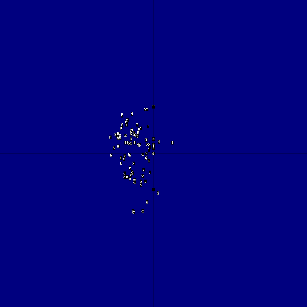
And now, to blow this thread up totally and to make these lines hard to read, here's one fun graph I did at some point, just trying to figure out the x/y pixel balance of characters.. what's to take away from the graph is that the charset isn't all too balanced, but that's about it.
As an example, think of a 8x8 block with two lit pixels. If the pixels are at the center and next to each other, it'll look brighter than if the two pixels are in opposite corners. Of course, if you fill the whole screen with these, you'll end up with pixels touching again, which is (yet again) different brightness. Hm, maybe I should blur the whole screen at once, to let glyphs bleed to their neighbors.. food for thought, eh? =)
My braindumpish research can be read here: http://iki.fi/sol/textfx/. The main differences between mine and radman's approaches are that he uses the whole charset while I like the ascii subset more, and he scales down while I blur; which approach is better is a matter of taste. I'd welcome similar writeups from other folk who have done rgb->ascii conversion libs.
And now, to blow this thread up totally and to make these lines hard to read, here's one fun graph I did at some point, just trying to figure out the x/y pixel balance of characters.. what's to take away from the graph is that the charset isn't all too balanced, but that's about it.

It's font specific, but I think there are some generic sets like " .0#". :z
Sol: My good man, I noticed that you are very studied in the ways of text art. Thank you for explaining so much details about it all.
Sol: My good man, I noticed that you are very studied in the ways of text art. Thank you for explaining so much details about it all.
@Danguafer: well, I didn't do a thesis on it, but I recall someone else doing just that.. =)
And all of these are just tinkering with things, I'm pretty sure someone with computer vision / codec background could do better.
And all of these are just tinkering with things, I'm pretty sure someone with computer vision / codec background could do better.
Radman?!

sol_hsa: have you tried figuring out character brightness by comparing the amount of contiguous black area vs contiguous white? Seems to me that an imaginary character that is a white square filling half of the character cell would be calculated as 50% grey when you average the pixels, but it appears much brighter than a checkerboard pattern to the eye.
Perhaps your algorithms would benefit by preferring noisier characters, a simple loop though the character pixels counting the flips between black and white would offer a good measure of how noisy a char is.
Perhaps your algorithms would benefit by preferring noisier characters, a simple loop though the character pixels counting the flips between black and white would offer a good measure of how noisy a char is.
Here's the result of my playing:

I was just trying to experiment Sphere Tracing with Text Art.
@trixter: or maybe we just should let some artist figure out some cool grayscale ramp =) Or, find someone with codec/computer vision background to give some actual algorithm for this..
I think you can get some pretty good results if you combine the count-pixels method with some shape analysis on the image, i.e. a weighted color level vs adherence to the original image.
maybe even more so if you add some blur to the char with a low-pass filter before comparing to the image
Hahaha, guess who just started reading sol_hsa's excellent article! :D
Depends on the font. Calculating weighted coverage works generally well.


nice and pure monochrome. but now add some greyscale ramp colors and do some eigenvector shit on the chars bits to make it perfect.